For my data visualization, I tried to track how healthy I was on a normal day. Although health is comprised of many many different factors, I chose 5 categories that would be relatively easy to measure:
- Minutes asleep (I have a fitbit which measures this for me)
- Active minutes (my fitbit also records this)
- Number of hugs
- Minutes outside
- Happiness (/100 so that the results were visible). Being healthy is quite important to me, and so that is why I chose to track it.
From the data I have collected, I can conclude that my everyday healthiness varies A LOT! Sleep plays a large factor, and it is easy to see that college has well and truly messed up my sleep schedule. Some other interesting conclusions are that on some days I spend very little time outside. This was surprising to me because I have always enjoyed the outdoors and just spending time in the sun, but on days when I have a lot of work, or I nap in the middle of the day, I spend a lot of time indoors. I also hug a lot, but it doesn’t appear to be that significant because of the scale I used on this category compared to the rest of the data.
In general, I think I was partially able to answer the question that I had posed for myself. Although my investigation wasn’t entirely all-encompassing, it gave me a rough idea and allowed me to realize some important things about my everyday life.
While gathering the data, I had to make several judgement calls about the scale of each data set collected. For example, I rated my happiness / 100 instead of /10 so that it was visible on the chart, I also rounded the number of hugs and minutes outside to the nearest 5 hugs/ 5minutes so that I had easier numbers to work with.
If I were to do this project again in the future, I would go about it in a similar way. If there was a tool that I could use to more accurately measure how long I spend outside, or how many hugs I gave, my data may be marginally more accurate, but in general, I think that I was able to collect my data with a reasonable standard of accuracy. I may also change the scales that I use, so that the number of hugs I give in a day features more prominently amongst the other data.
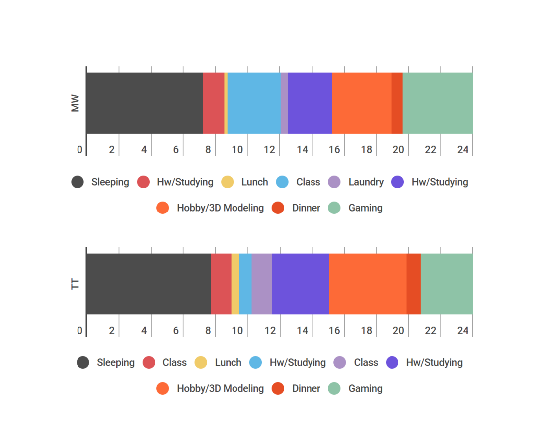
I chose a stacked bar chart to present my data because I think it gives the clearest representation. All of the individual pieces of data give a cumulative representation of my health on that day, and the bar graph certainly represents this clearly.
I have found this to be a pretty good tool of self analysis because it made it me realize new things about myself. However, in order to get a more comprehensive view of my health, I would record more data that is involved with health, such as calories eaten, sneezes, coughs, etc or number of breakdowns a day. Overall, I am pleased with this project.
sk10