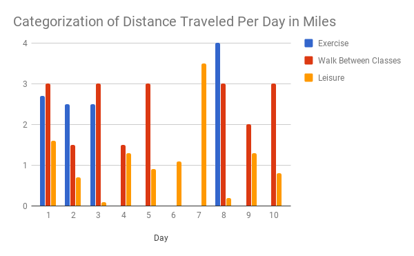
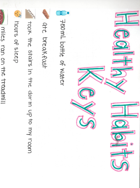
For my project, I chose to track my stress levels over the course of a few weeks. Since stress is such an intangible things, I was curious how stress manifests itself in my day-to-day life. To quantify that I decided to assess my stress levels through four different measurements: anxiety level, number of hours slept, time listened to music and number of pages read. I tracked these four measurements for two weeks, during which I had tests, homework, papers, social events and events for extracurricular clubs. Looking back on these two weeks, they are fairly representative of most of my college life so far, in terms of stress.
I set out to find out how stress shows itself in my everyday life and I believe I got the answer, at least in some ways, that I expected. Of course I couldn’t track every aspect of my life for two weeks so narrowing down on things I do consistently daily was important. I was conflicted as to what to include – there are many things I do every day – but landed on a few daily activities that measure both leisure time and work time, physical things and psychological things. I chose anxiety as my first indicator because it is almost directly linked with stress and I’ve had a complicated history with anxiety before, so I’ve had practice tracking it. I chose hours of sleep because, through my tracking of anxiety, I found that my sleep is directly effected by the amount of stress I am undergoing. I measured the number of hours I listened to music because I generally listen to music everywhere I go, whenever I can, so I figured, since I generally can’t listen to music when working or studying, I could track the amount of stress I was experiencing by paying attention to how much music I listened to every day, the less music listened to, the more stress I was undergoing. Lastly I chose to measure the amount of pages I read each day. I chose this measurement because a lot of my stress is related to work I do on a daily basis. A lot of that work comes in the form of reading, so I figured that depending on how much reading I did that day, I could track the amount of work I had and therefore stress I was.
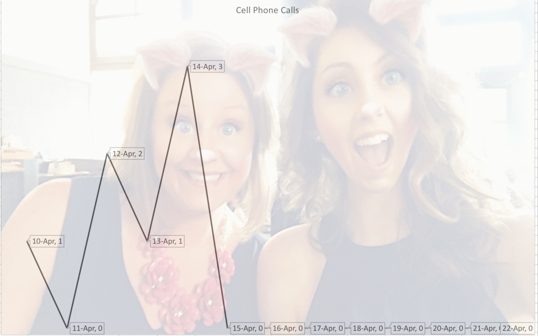
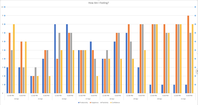
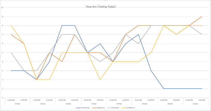
Tracking wasn’t hard, I was able to remember to track and log all the measurements I set out to track. I thought a while about what the best way to visualize all the data was. After trying a few of the programs suggested by Professor Morgen, I decided to use the free-website Infogram, which was very easy to use.
The conclusions I drew from the resulting data was at first a little shocking. I surprised myself with how little I sleep sometimes, how many hours I spend with headphones on and with the amount of pages I read a day (it always feels like more…). However, once I thought about the results a little harder, I realized that I really was not that surprised after all; I had been living the numbers for almost a year and seeing them on a screen, while initially startling, started to make sense. I found myself saying “that seems about right…”. I guess that’s a pretty unsatisfying conclusion, but it makes sense to me. If I were to continue this project further I think I would change a couple measurements. I think instead of looking at the level of anxiety I experience and the number of pages I read, I would choose to track the number of times I complained about something in a day and the amount of words written (either by hand or digitally). I think those two combined with the other two measurements I kept would make for a much more interesting and telling statistic.
You can access the Infogram here.


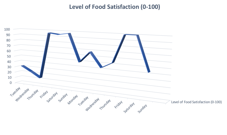 Throughout the span of almost two weeks, I recorded my level of food satisfaction on a subjective scale of 0-100. This tracking assignment yielded some interesting results, which after developing a visual representation of the data, revealed key information about my eating habits throughout the week.
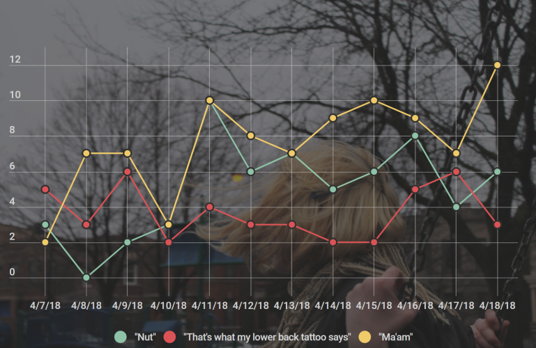 Just saying the word “ma’am” in response to anything that aggravates me, might not be a joke exactly. But it makes me laugh and I say it lot so I included it. Alongside that are the phrases “nut” and “that’s what my lower back tattoo says” (as I’m trying to explain these jokes I realize that my sense of humor might be a little off-the-wall) Sometimes I respond to things that people say with “that’s what my lower back tattoo says.” ie: My friend was talking about something and said the phrase “You don’t have to be perfect” and my response was “that’s what my lower back tattoo says”. “Nut” is just an oddly sexual and super inappropriate way to respond to anything that I think is cool. Another friend of mine told me that she was going to a lecture about traditional African art and the movie Black Panther and my response was “nut, dude”.