Sketch 11: Assembly of a Poorly Drawn Bike
I felt the most appropriate thing to represent this class was the bike, the item we had to attempt to poorly draw in class.
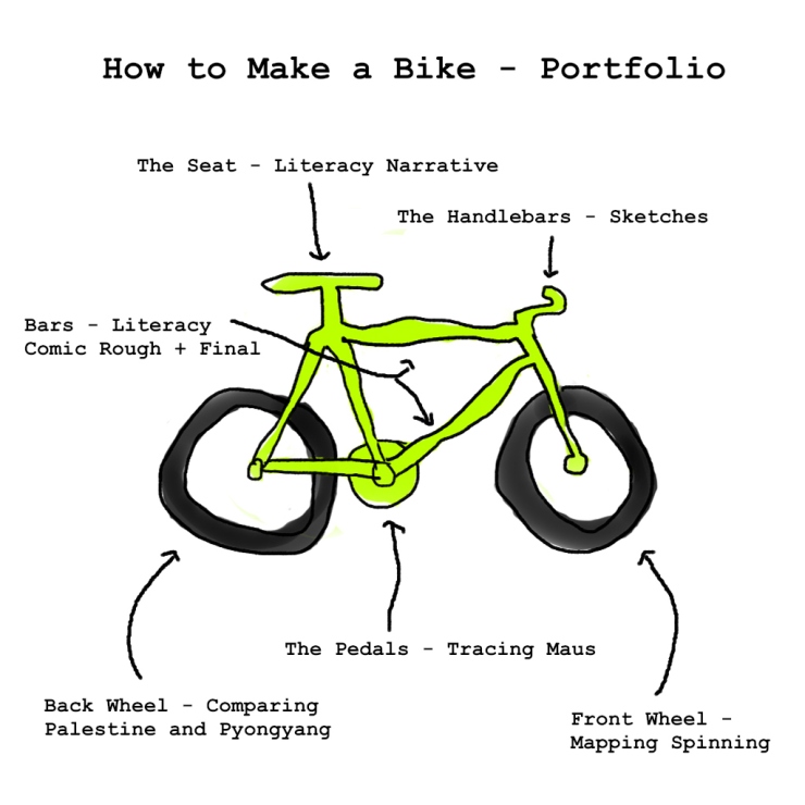
For a little explanation:
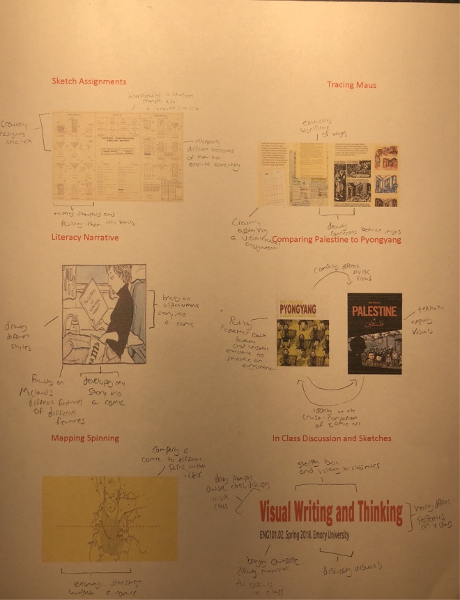
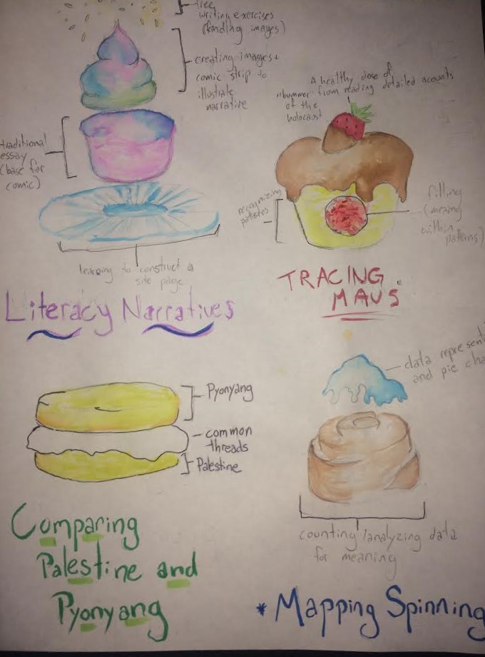
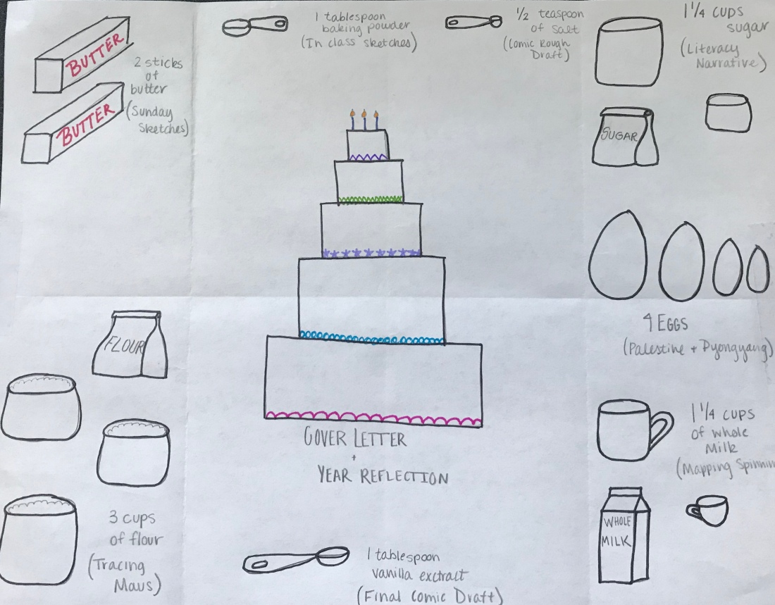
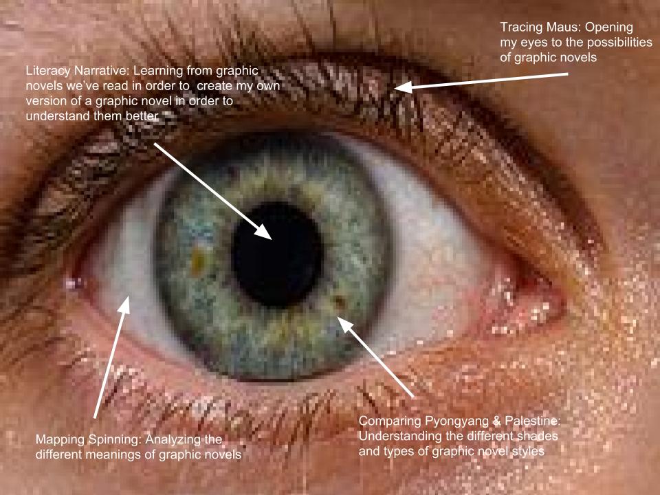
The seat is the original literacy narrative that we did. The reason for this is because the seat is what we always relax on and where we feel most comfortable sitting. We don’t like sitting on the handles, the bars, the wheels, or any other part of the bike except for the seat. The literacy narrative, a full blown alphanumeric essay, is what we used to comfort ourselves in this strange new world of analysis through comics and art.
The pedals represent our first major project, Tracing Maus. This project is what helped us start to move on our bike, and get us pedaled in a new direction. This project was cool and interesting enough to attract anyone towards the idea, and attempting to analyze anything to the intricate level that we did will always our eyes to new ideas.
The handlebars are the sketches that are done throughout the whole semester. Though small, these sketches held guide us in the right direction and keep us on track between the major projects. The sketches challenged us to think differently and keep on the path of diving further into the world of comics.
The backwheel is Comparing Palestine and Pyongyang because the back side are those projects that dealt with more alphanumeric ideas. This “side” idea will come into play later.
The front wheel is Mapping Spinning because the front side are those projects that dealt more with the artistic ideas. This “side” idea, again, will come into play later.
The bars in the middle are the draft and final draft of the literacy comic. This is the connecting point between the back side (the alphanumeric) and the front side (the art). It shows that to create a fully functioning bike, you need both ends.
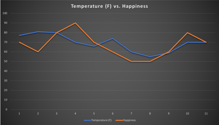 For this assignment, I wanted to determine whether the weather has any influence on my general mood. I therefore decided to record the highest daily temperature and my happiness from 0-100 each day. While recording the temperature wasn’t difficult due to its objective nature, determining my mood was totally subjective. However, I tried to keep this consistent so I recorded my mood at 9PM everyday in order to avoid timing bias. When creating the chart, I decided to represent the two sets of data as lines in order to see if there was any visual similarity between the two. Before I began I had thought that if the temperature went up my mood may as well, but this was not the case and the data had a very low correlation. I think the greatest flaw of my project was that temperature doesn’t accurately reflect the general weather outside.