Sketch 11: Assembly of a Poorly Drawn Bike

I felt the most appropriate thing to represent this class was the bike, the item we had to attempt to poorly draw in class.

eng101sketch11

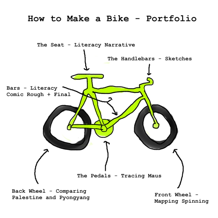
For a little explanation:

The seat is the original literacy narrative that we did. The reason for this is because the seat is what we always relax on and where we feel most comfortable sitting. We don’t like sitting on the handles, the bars, the wheels, or any other part of the bike except for the seat. The literacy narrative, a full blown alphanumeric essay, is what we used to comfort ourselves in this strange new world of analysis through comics and art.

The pedals represent our first major project, Tracing Maus. This project is what helped us start to move on our bike, and get us pedaled in a new direction. This project was cool and interesting enough to attract anyone towards the idea, and attempting to analyze anything to the intricate level that we did will always our eyes to new ideas.

The handlebars are the sketches that are done throughout the whole semester. Though small, these sketches held guide us in the right direction and keep us on track between the major projects. The sketches challenged us to think differently and keep on the path of diving further into the world of comics.

The backwheel is Comparing Palestine and Pyongyang because the back side are those projects that dealt with more alphanumeric ideas. This “side” idea will come into play later.

The front wheel is Mapping Spinning because the front side are those projects that dealt more with the artistic ideas. This “side” idea, again, will come into play later.

The bars in the middle are the draft and final draft of the literacy comic. This is the connecting point between the back side (the alphanumeric) and the front side (the art). It shows that to create a fully functioning bike, you need both ends.

Mapping Spinning: Reflection

This project. And all the panels. A pain in the butt to count, YES, but a good pain (????). After counting tons of panels and trying to see what I felt, I feel like I understand Spinning as a very different book. Upon initial readings, I thought it was a very sad book. It had a great message, but all I could remember was the hardships and negatives that occurred in the book. But then I looked at it all, and I noticed that there were still panels that displayed positive emotions (hope, happy, etc.). This helped to change Spinning from a book about sadness to a book about life, and it shows that life will have ups and downs, even if you can only see one side.

It was also strange quantifying Spinning. The book felt so emotional that it seemed impossible to “count” anything within Spinning. But it was actually somewhat refreshing to count it all. It helped me understand this book much better all around, as said previously.

To come up with this idea, I simply asked myself what I felt Spinning was emotionally. I’d thought much of Spinning was negative (and a lot of it still was!), but I wasn’t completely sure if it was as one-sided as I remembered. So I was curious enough to judge 1500+ panels on what I emotionally felt in the given moment of reading it.

I think I succeeded in what I wanted to see. Even though it’s quite messy with loads of numbers, I can start to visually see the differences and changes that the book goes through emotionally. However, there are massive limitations to this map. It’s all subjective, which is already very limiting. Furthermore, there are some emotions that are hard to distinguish between each other (annoyance v. frustration) that one has to make tough calls on. But overall, I’m actually quite satisfied.

Sketch 10: Unproductiveness


We all want to be super productive people. But tracking it may be scary.
I decided, with this sketch, that I wanted to see just how unproductive I was. But there were a few issues with this idea that we MUST talk about before diving into the data.
1. It’s almost finals week. That means that much of the week will HAVE to be spent being productive, giving this a slight edge to the productiveness of my life. This type of test would be most fair in the middle of the semester, where midterms are present. This way, you would actually have to be productive but not for as long of a period as for studying in finals.
2. I’m not always studying any time I’m not doing any of the things I tracked. I could be walking to class or having a stack or something that is tiny. But I can’t track each waking minute, so I have to generalize.
3. I could also be watching a YouTube video for only 5 minutes, but it’s hard to count those because it’s such a minuscule time. These small times could add up, and I may miss up to 30-40 minutes simply because I don’t count all the little 1 minute segments of watching something or the glances at Twitch streams.
Now, with that out of the way, it’s time to dive into the conclusion. It’s pretty clear that I’m a lot more unproductive on the weekends, simply because that is what I typically consider my “break time.” But I was surprisingly productive on the weekdays. Even when I took out my dinner and lunch time, along with my class time, I’m still looking pretty decent, with the exception of a few days.
I was actually able to overall answer my question. I was pleasantly surprised at the results, for I thought the situation was going to be a lot worse than what it actually was. I chose to see the data in the form of pie charts and bar graphs because it was mostly categorical, with the exception of the bottom graph over the course of several dates. However, I believe that, because each day was independent of the other, I would act as if each date was a category.
I’d say that this project told me that I’m actually a lot more productive than I lead myself to believe. This is both encouraging and dangerous, because it means I may have more leeway with myself being unproductive because of some excuse involving “but I work so hard.” I’d continue to do this the same fashion if I were to continue this, and I really liked this project (to a certain extent; sometimes it was an inconvenience).


Comparing Palestine and Pyongyang Reflection

This essay was a joy to write. But, I will admit, I did have to think a little about the topic. However, it was actually quite easy to decide upon when I looked at the two books from a broader point of view. When doing so, I saw that, as an informational book, Palestine is far better to Pyongyang in accomplishing that purpose. This is the overarching idea of the essay.

As for drafting, I went through only two or three. Most of it was done in one go, followed by adjustments to structure and length, and then adjustments to smaller details, like grammar and spelling and the points being made. Otherwise, I didn’t really change too much. I was pretty happy with the way it was written (for now), and I think it gives the message I wanted it to give.

In order to think of my idea, as stated, I just stepped back and looked at the books as a grand idea, not as individual vignettes. What’s the purpose of the book? What do they do good? What don’t they utilize enough? Through these questions, I was able to come to the idea of giving information. As we have discussed in class, these books are somewhat journalistic, and what does journalism do? It tells a story and displays a message. So which novel did this better?

I started to break down why I believed Palestine did this purpose better than Pyongyang. For this, I had to get rid of my subjective view and attempt to view it purely in the eyes of relative objectiveness. This meant I had to ignore the ease I felt when reading Pyongyang and think about how this ease hurt or helped Pyongyang. Likewise, I had to ignore the discomfort I felt when reading Palestine and why it hurt or helped Palestine.

In regards to the organization of my essay, I had to avoid a five paragraph essay. My three major points were ethos, logos, and pathos of the books. While I tried to fit it all into one paragraph, it would just turn into a giant paragraph that no one would want to read. So I broke each of them up, put up my antithesis, and finished with a conclusion. With an introduction at the beginning, this came out to 6 paragraphs, which wasn’t formatted in the traditional 5 paragraph essay, so I was satisfied.

Overall, I enjoyed this essay. It was a fun way to think about how vignettes help the author portray their message AND how these vignettes could differ and give better or worse in helping the author accomplish their goal.

Sketch 9: (Trying to) Recreate a Movie Scene

eng101assign

I was not a fan of this assignment.

I don’t watch movies, TV shows, or anything really. I kinda just stick to YouTube and things like that. So when this assignment came up, I knew I’d have to think hard about what I could do.

Everything that came to mind was an animation move/show/whatever. And the issue with that is that most of the objects in those movies feel so abstract that I couldn’t make any real world equivalents.

So I thought and thought more and more. The deadline came closer and closer. Still nothing.

It took having to email Professor Morgen before an idea even came up, and I still had to think about how to execute it.

This was really a huge struggle for me, and I would’ve absolutely loved if drawing could’ve been incorporated. Perhaps it’s just because my creativity may be limited to creating things, not utilizing things. I would like to think that’s not the case, but only more exercises can really indicate how true this is.

Sketch 8: A Glass of Light

eng101sketch8

Flashlight Image Source

Glass of Milk Image Source

A flashlight and a glass of milk. Or is it milk? I can’t really tell.

The idea was quick to come. Within a few minutes of reading about the assignment, I actually managed to think of the idea. The trouble came in execution.

Firstly, it was difficult to find a good image of a flashlight that was purely flat. Most of the images were simply images of flashlights angled towards or away from the camera. However, most of the milk/drink pouring was angled flat/horizontal to the camera. So trying to find both flats was difficult.

Editing was quite easy. I’ve been photo editing since early middle school (but just as a hobby), and this was a very simple task, so that was no trouble.

But there were more challenges. I’m still not completely satisfied with how it turned out. The way the light shines on the flashlight itself makes the tip look like it’s gone when contrasted with the light background, causing an awkward link between the pouring and the end of the flashlight. In the same vein of awkward, the angle of the pour is also awkward when compared to the flashlight. There isn’t enough horizontal pour (in my opinion), making it look extremely unnatural. When I look at Mcmennamy’s art, it looks so natural. But mine just looks like someone who didn’t know what they wanted threw something together and settled. I hate that idea because I really didn’t know how to improve it. I felt somewhat dissatisfied with it, but it was still better than the other images found.

Overall, it’s just a simple flashlight pouring out some milk. It looks decent, but certainly not as good as Mcmennamy’s. And once you see that, can you really go back to make something like this?

Sketch 7: THAT Back Corner

eng101s18sketch7

This comic was a funny moment in my spring break, hanging out with friends. But I realized it also could have a deeper meaning to it.

I decided I would grab dinner with a couple of my friends, as I’d missed them a lot and hadn’t seen them for a while. We arranged a time to meet up, and I showed up about 5-10 minutes late. I was worried they’d already started to eat, so I texted one of them and asked if they were inside. A quick reply told me they were here. I checked around initially, asked where specifically they were, and continued the search. After a bit, I came outside to call, and I discovered they were sitting right outside on the bench. Then, they joked with me that it was “outside back corner” that they meant. I wasn’t actually upset at them (I’m used to their shenanigans at this point), but I drew it that way in the comic because it felt more conclusive.

I knew this was the right story because it teaches a valuable lesson. It teaches the lesson of perspective and how it can affect things. While it was true that they were in the outside back corner, I had assumed they were inside of the restaurant in the back corner. But, of course, I had assumed the logical path and didn’t even consider the illogical path. But life isn’t logical. At least, not always. There have been many things that have happened in my life, and likely your life, that have made us think: “That doesn’t make sense.” Perspective and logic are two things that are, sometimes, taken for granted, and we don’t seem to account for the idea that things don’t always go one certain way.

It’s actually quite difficult to tell a true story in a short comic. Most “truths” or “events” go well beyond a simple single-digit panel event. So to find something to condense into a short and sweet comic is absolutely difficult. Especially when you are attempting to find some “truth” in it. With the two poles of a spectrum being Spiegelmann and Sacco, I imagine that this story falls more on the side of Spiegelmann. It tells the perspective of a decently truthful event without too much bias, similar to the style of Speigelmann’s Maus.

While creating this comic, I had to decide the style and panel formation that I wanted to go with. I decided on a big panel for the last punch line, as I feel that would amplify it that much more. I decided on a more stick-figure like format for the characters because I wanted it to be simple. But I also wanted to experiment with expression on stick figures and without faces. I’ve seen it quite a few times previously, and I really wanted to try it out. I think it turned out okay, but I might go back to drawing faces; it’s easier for me, even if my faces are terrible.

Class Cancellation Sketch: Colin Combs

eng101s18class_032018

This image had a strange aura to it. It was blurry, it was rainy, and it was moody. But it just looked so peaceful at the same time. Rain is both so overpowering, yet so refreshing. It causes destruction, yet also can be peace. I’ve always loved and hated the rain, and it was the biggest element that drew me to this picture.

As I spent more and more time with the photo, I began to notice more of the subtle things. The facial expression of the person in front. The posture of the person behind. The slight angle of the photo. The condition and structure of the houses. All these things start to gain more and more clarity. I felt like I was really there, having to rain through the rain. The blurriness adds so much more.

The fact that these photographs are not created professionally doesn’t surprise me. There’s always been a certain charm to photos that are simply taken in the moment. They’re sloppy, and in the eye of a professional, I’m sure they aren’t very good. But knowing that someone simply wanted to capture the moment is so amazing. There is no other major reason behind it. No want of money, fame, or anything else that ruins art. It’s just art for the sake of art. Art for the love of art. Art for the beauty of art.

I hope these types of art forms continue on as time continues. This is what true art is. Passion.

Literacy Comic Narrative Feedback

Click to view slideshow.

Personally, I wasn’t a fan of the draft. It wasn’t the message I wanted, it connected things differently than how I feel, and it didn’t portray the right emotions.

This is evidenced by the feedback I got. Without words, a lot of the interpretation of this comic is so up in the air. For example, the tone is assumed to be friendly and comedic, but I had intended for it to be a darker story with hopefulness. While there is one scene of comedy and friendliness (hence the assumed tone is not out of nowhere), I don’t want for that to be the overbearing feeling from the story. In the same fashion, I wanted for the theme of the story to be that writing has saved me. However, because of the lack of words and the poor connection between a lack of reading turning into a plethora of writing, it is assumed that the theme of the story is about reading. This I also don’t want. One piece of evidence that worked against me was the poem I placed on the OPTIONAL first page. This was supposed to be a symbol of my writing career, however, because of lack of specification, it is now assumed to be a symbol of my reading career. While my variation in camera angles, frames, distance, and such are all decent, the overall message of the story is way off when comparing true meaning and interpretation. This is something that needs to be adjusted and fixed ASAP.

And, of course, hopefully words can fix that too.

1 2 3