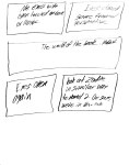
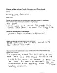
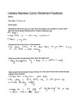
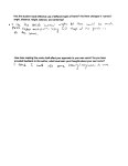
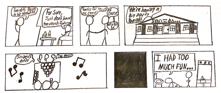
Sketch 11: Assemblies

new doc 2018-04-29 18.44.48_1

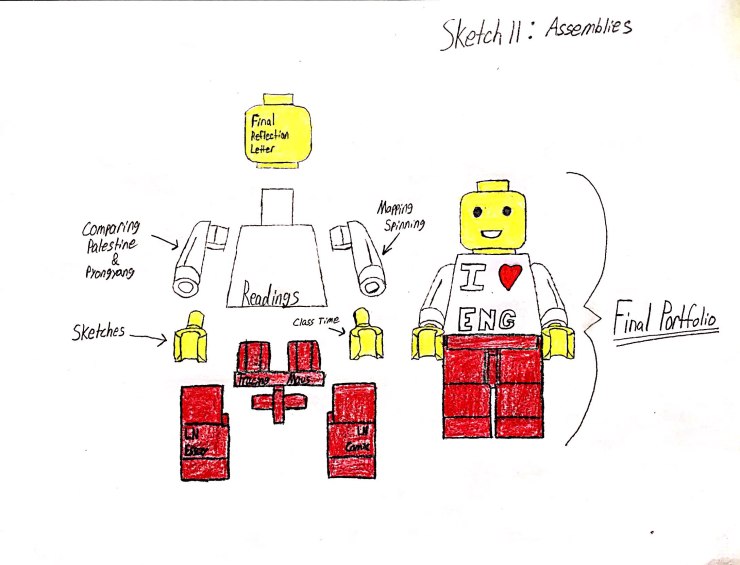
As a kid, I loved legos. I always enjoyed the feeling of putting all the pieces together and gazing at the final sculpture I created. So for this sketch, labeled “assemblies,” I thought there would be nothing more appropriate or personal than drawling a lego man. While keeping the metaphor of a final portfolio and what comprises it in mind, I chose to make side by side drawings of the pieces of a lego man and a completed lego man. The former representing each aspect of the class, and the later being the collective whole.

I chose each leg to be one part of the Literacy Narrative because they are in many ways reflections of one another. In addition, legs are what carry the rest of the body, so without those initial assignments we wouldn’t be able to have progressed. The groin is Tracing Maus because it is the assignment that came between both parts of the Literacy Narrative and helped transition us from only writing to drawling. The torso is represented by our readings because it is the center of the body and is where everything else stems out from. The arms are Comparing Palestine & Pyongyang and Mapping Spinning because they are what we used to further build upon our skills. The hands are sketches and class time because they gave us the dexterity to fine tune our skills throughout the semester. Finally the head is our Final Portfolio because it is where our minds are directed at currently.

Sketch 10: Data Visualization

Temperature vs Happiness
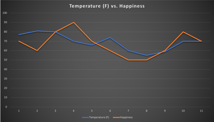
For this assignment, I wanted to determine whether the weather has any influence on my general mood. I therefore decided to record the highest daily temperature and my happiness from 0-100 each day. While recording the temperature wasn’t difficult due to its objective nature, determining my mood was totally subjective. However, I tried to keep this consistent so I recorded my mood at 9PM everyday in order to avoid timing bias. When creating the chart, I decided to represent the two sets of data as lines in order to see if there was any visual similarity between the two. Before I began I had thought that if the temperature went up my mood may as well, but this was not the case and the data had a very low correlation. I think the greatest flaw of my project was that temperature doesn’t accurately reflect the general weather outside.

If I were to do this in the future, I would not go about it in the same manner. I would likely try to find a way of quantifying how bright and sunny the day is in addition to temperature because rainy days occur and may have a different impact on my day then I previously realized. In addition, I don’t think the comparison is really fair to begin with. There are so many factors that contribute to happiness, and simply relying on weather won’t truly capture the whole image.

Overall this was an interesting project to take part in and even though it wasn’t particularly telling, taking the time aside to assess my mood was beneficial. Realizing the flaws helped me come to a better personal understanding of happiness and the various facets of my life that contribute to it.

Sketch 9: Happy Gilmore

As a kid Adam Sandler was one of my favorite actors/comedians, so I thought it would be fun for this assignment to recreate one of his scenes. Even though he isn’t the most respected actor, I think some of his early films are entertaining. I knew I would be limited with resources so I tried to keep things simple. I chose the closest shirt I had, borrowed a golf ball from my roommate, and used a cup as the hole. I didn’t want to dig into the ground, so I decided it would be best to surround the cup with pine needles instead. I got several friends to come out and help in the background and actually take the shot. Although the image isn’t that close, I think the general theme is conveyed.

Literacy Comic Reflection & Drafting Process

When I first was told of this assignment, I immediately knew I wanted to incorporate this aspect. I initially thought I would stay close to the text, but after going over sketching and outlining I decided to take a lighter approach. Unlike the comics we have read for class thus far, I chose to incorporate color. Whenever I think back to my youth, I had always associated comics with superheroes and bright colors, so I wanted to do so in my own comics. One thing I didn’t anticipate in regard to coloring is the sheer amount of time it takes to properly shade in a panel; let alone sketching. All in all the time spent on each panel was a little over an hour. However, there was no burden in completing this assignment. I can honestly admit this was the first time, I have ever felt in any capacity like a true artist. It has been extremely gratifying and has allowed me to garner great respect even for the lowest of craftsman. If nothing else, I have a new found admiration for artists dedication and frequent excellence.

Returning my own experience, I wanted the comic to be lighthearted and imaginative. I wanted to challenge myself by limiting speech to its absolute concision. In doing so, I was required to carefully draw and shade. I chose predominantly primary colors in order to highlight each of the different aspects within the panels. I was somewhat limited in the number of shades I had, but chose the most fitting for each section.

In regard to story structure, I did my best to ensure its simplicity due to the comic’s lack of linguistic expression. I began the story right outside the tour bus, so the reader would understand some background and help guide the time lapse. I then took the story into their seats where the main character would spend the most of his time. The first seated panel depicts a breaking off of a likely previous conversation in order for either individual to read or relax. The next panel focuses in on the main character opening the book and a new world. The large bottom panel then shows the book emanating light as if commencing a magical encounter. The next page begins with a panel showing his imagination bubble emerging, but not with any content yet. The subsequent panel depicts the main character closing his eyes after reading the material, and envisioning people from the story. The large middle section shows the main character transported to the world of the story in a large landscape. After that, the character is nudged awake then told they have arrived in New York.

Combo Photo

The reason I chose Edvard Munch’s The Scream is because its an iconic image that I believed had interesting potential for a remix. The scared cat emoji was chosen as the second photo because I think it mirrors the emotion of the original subject fairly well. Making this was very challenging because I have limited experience with photo editing. Trying to crop the emoji was the most difficult aspect. I also scrunched around the eyes in order to go along with the paintings original look. I think my final image conveys the same existential terror felt by Munch’s subject, but with the  levity of something unsuspected.Screaming Cat

Tell a True Story

new doc 2018-03-25 15.23.15_1

I knew I had the right story for my comic when I realized I had too much fun. I first read Tim O’brien’s The Things They Carried in my junior year of high school and initially hated it. I didn’t like his weak character and wasn’t fond of hearing anything from him. However, I did understand his points and perspectives on the different “truths” we have. So following the prompt, I followed his style of a story that has some truth but not necessarily the reality I faced. As such, I generalized the experience so that any reader could apply it to a night out they might have had.

On the spectrum of telling the truth, I think this comic is closest to Spiegelman’s work because it generalizes people with stick figures and communicates the general idea better than factual accuracy.

I think the most striking and important element is the black box. It tells the reader that there is a gap in the sequence of events and allows the reader to fill it in with their own imagination.


FIRE

The first thing that drew me to the image was the contrast between light and dark caused by the fire. As I started to draw my sketch, I realized how difficult it is to capture proper shadowing. Along with that came the realization of how light and darkness give apparent focus to different aspects of an image. My eye seemed more disposed to  light, so for me the most striking part was the fire. Afterwards I focused on the dark edges that border the smoke or the people who block out light. The way in which the smoke drifts out across the image creates a medium in between light and dark that is very compelling. The reason I think this image is considered art is for the intentional use of a poor filter in order to accentuate light, dark, and haze of smoke. The elements are natural but altered.


new doc 2018-03-21 22.45.30_1


What’s In Your Bag

The items I usually carry in my backpack:

  • Notebook
  • Laptop
  • Calculator
  • Pens
  • Pencils
  • Sunglasses
  • Book weight.

I felt this was a relatively simple project because I typically don’t carry much in my backpack. I don’t know that this really represents me, but I guess I typically do keep things simple and organized. While making this image, I made sure to keep everything in line within the width of the bag in order to create a line of sight within which to view the items. I think getting the lighting right for the image was the most difficult part because I didn’t have a good light source. I overcame this by changing the light gradient in the photo editor on my phone. I don’t think representing myself in a catalog of the stuff in my bag as a type of writing because I typically associate it writing with language. However I do see how one could make such an association.

IMG_5204


Tracing Maus Reflection

Before starting this project, I thought it wouldn’t be particularly difficult. However, I was immediately amazed at how long it took to even trace the individual pages of the book. For each page I must have traced for at least an hour and a half. I would definitely say that my tracing ability has improved as well as my recognition of proper tracing technique. In the first tracing, I often would smudge the graphite because of my hand. Consequently, I learned to draw left to right and carefully avoid contact with the paper as best as I could. After all of the tracings, the annotation proved to have its own problems. I initially though that I would just highlight certain aspects of the page, but after looking at a classmates annotation I realized I should cover the page in text. So, the annotations also took me around an hour and a half each. Next came writing about the different themes throughout Maus. I didn’t have any particular trouble with this part, but it was time consuming writing all of the ideas out. Finally came creating the landing page and posting the work. I found this to be the most gratifying part of the project because it felt like I truly finished as well as having something tangible online. Overall I would say this was a fun yet time consuming project.

Triptych

While looking around my room for inspiration, I gazed upon my chess board. After giving it a stare down, I knew how I wanted to use it for the triptych. I thought it would be interesting to play with the expectation of the names for each piece by swapping the title of knight for pony. In order to compose the triptych, I set up all of the black pieces to give the viewer a setting of a chess game. I then isolated the white pieces to highlight the individual characteristics of each piece. I used my desk lamp for extra lighting to further accentuate the pieces and draw attention to the background where the names were placed. To me, the most challenging part was combining the individual photos I took into one photo. However after finding a website that could do it, the rest of the editing was simple. The route I took for this project was different than most of the other assignments we’ve done because I used pictures instead of drawling. Overall I found this process to be relaxing and enjoyable.

Triptych .jpeg

1 2