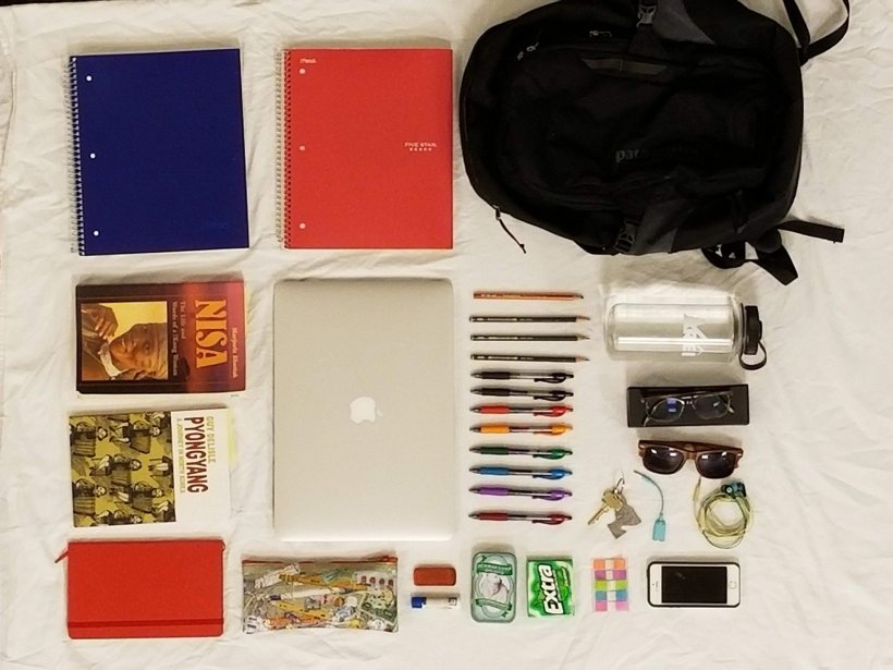
Sketch 11: Assemblies

sankeymatic_1600x1200

While this is less of an architectural diagram, it certainly is a diagram. With this, I wanted to visualize the components of this class and categorize them. I had originally had the class flow into two main groups: work we read and work we created ourselves. Of course, all of the books we read would come from the first group, and everything else would go into the second group. However, this set up made the graph too wide, and it looked better without that addition. I think that the right hand side gives a good summary of all the things we did in this class. Flowing upstream in the diagram reveals how I have thought about the class components and their organization. Through this assignment in particular, but also through the course in general, I have found more and more that I really enjoy making data visualizations.


Link to Sketch 11: Assemblies Assignment

Website I Used to Create Diagram (SankeyMATIC)


Sketch 10: Data Visualization From Everyday Life

Throughout this project, I was concerned that the act of consciously collecting data would actually alter the outcome of the data. The fact that I knew I was recording my actions would probably lead me to increase or decrease that behavior based upon my preconceived notions of whether that activity was positive or negative. Instead, I looked for data that had already essentially been collected and logged. This led me down a little bit of a rabbit hole where I became more mindful not only of the abundance of data that I create, but the amount that companies like Google and Facebook are able to take advantage of that data. I decided to focus on my browser history since I utilize the internet almost constantly. I also believe in being somewhat unbiased with my hypothesis when first starting out with research. I didn’t want initial interests blocking me from finding something intriguing that I wouldn’t have expected. In the course of my searching for a program that could go through my internet history and collect some numbers, I found a browser extension called Web Historian.

These are some heat maps describing my clicking activity versus dates and times. 

April 2-8

HeatMapBrowserApr2-8

April 9-15

HeatMapBrowserApr9-15

April 16-23

HeatMapBrowserApr16-23

These are some word clouds constructed from my unique search terms.

April 2-8

Screen Shot 2018-04-23 at 12.16.22 PM

April 9-15

Screen Shot 2018-04-23 at 12.15.33 PM

April 16-23

Screen Shot 2018-04-23 at 12.15.04 PM

This graph describes the amount of time I spend on certain webpages.

April 3-23

Screen Shot 2018-04-23 at 12.20.10 PM

As a result of seeing this data, I am most concerned about the times of day I am using the internet. Most of the heat maps show that I was active online in the late evening to early morning. I know that looking at a screen will make it harder for me to fall asleep. An erratic sleeping schedule has also been linked to numerous health issues. I will probably look into another browser extension that limits the websites I can visit during a set window (when I should probably be sleeping). I will probably be looking into other ways to monitor the data I am sending out into the internet in the hopes of being more cautious about companies monitoring my information.

In the future, it will become exponentially easier to track almost every data point you could ever want about your life due to better technology. There is something paradoxical about using technology, something that is definitely not human, to gain a closer understanding of humans / ourselves. I have been thinking about these things more so than I would usually due to this project. Another question I have been thinking about is how technology has affected our lives. I cannot really be a subject for this because I realize I have never really existed in an age where knowledge and computing power have been scarce.


Link to Sketch 10: Data Visualization From Everyday Life Assignment

Sketch 9: Recreate a Movie Scene

Behold, the Godmother!

It was difficult to find a balance to find a balance between these three ideals:

  • a movie I had actually seen
  • easily executable with minimal resources needed
  • recognizable/iconic (but still kinda unique/original)

I found that The Godfather satisfied all three of these requirements. I felt like the outfit ended up looking pretty good. If I had spent more time, I would’ve made myself have more wrinkles, a better mustache, and fixed the lighting so that it would cast my eyes in a deep shadow but my forehead and checks in a bright light. However, I am pleased at the quality of the end product considering the time frame and resources available.

I nailed the facial expression though.

30176183_1015691461912845_2049298083_othe godfather image

Sketch 8: Combophoto

Screen Shot 2018-04-01 at 4.33.02 PM


This particularly assignment turned out to be very difficult for me to get done. I think it has something to do with trying to find two photos that can line up physically and color-wise, as well as make some artistic sense. This was not my first idea, but by time I had gone through so many iterations of trying something out, my standards dropped and I caved with something that was relatively easy. I like that this combo photo shows up close something so small and something that is large so far away. I think the combination makes the viewer think about pollution since one of the images is nature, and the other a known pollutant that people still choose to engage with. The photo on the right looks more ‘clean’ to me, while the photo on the left looks more ‘dirty.’ This is interesting, considering that the actual content of the photo points to exactly opposite of this.

Image Credit:

IMGP7218” by Flickr user Tim Gage.

cigarette” by Flickr user Fried Dough.


Canceled Class Sketch

I chose this image because it was centered on two things very clearly–her face and hand, making it easy to establish a focal point to draw from. I realized that not only are hands hard to draw, but I can’t draw hands. On the topic of art, humans really like to create meaning from chaos and entropy. Thus, something turns from something to art when one intentions it. Something that comes to mind is a court case in the Supreme Court where the line had to be drawn to distinguish porn from not porn. The conclusion that was come to by Potter Stewart (a justice) was “I know it when I see it.” That’s basically how I feel about art.

Link to Assignment for Thursday’s Missed Class


Sketch 7: Tell a True Story

I had difficulty thinking of what do to this sketch on. When I realized that most of the time people’s best work comes from a situation that they feel strongly about. While I don’t know if this story is necessarily super engaging for the reader, I feel fairly strongly about it, and I think the reader would most likely have had at least a somewhat similar experience. It’s really about picking your battles. Deciding if you can or even should try to change someone’s mind. I first attempted to draw this, but then realized that a digital format would be much cleaner and easier. The more I look at it, I think it looks like a meme. This brings me to wonder if a meme can count as some sort of comic?

The image with the “March for Our Lives” comes from the March for Our Lives website.

The image with the devil and angel comes from the Simpsons.

Reflection on Tracing Maus

Getting the initial ideas for this project weren’t the main difficulties. For me at least, the ideas came freely. The two main difficulties seemed to be in the fact that the project is so spread out and untangling threads connecting the three ideas to make them distinct. I felt like I had a lot of things to say about these pages, but it was hard to draw a line between some of them due to the interrelatedness of the ideas.

The act of tracing the pages made me respect Spiegelman for the sheer amount of time alone taken to draw the pages, not including the planning of the individual pages or even considering the role of those individual pages in the larger storyline.

Overall, I think this gave me a better appreciation as to the thought that goes into posts that are online. I think I have also become more attuned to the ways webpages are set up to make them more easily navigable. I guess I had never really noticed when there was good design to a website, but I distinctly felt it when a webpage had poor navigation.

Link to Tracing Maus

My Bag

IMG_7639

Items:

Spiral Bound Notebooks: The blue one is for my humanities-leaning classses, and the red is for math/science.

Nisa: A book I’m reading for my anthropology course.

PyongYang: A book that we’re reading.

Planner/Journal: I don’t usually carry this around, but it is useful.

Keys: Comes with an Idaho keychain, which I have never used.

Water-bottle: Stay hydrated, folks.

Reading Glasses: I don’t need glasses usually, but they help for staring at screens.

Splitter: This was given to me by my ex-boyfriend when we broke up. We split and then he gave me the splitter. He had it given to him by one of his friends when her relationship ended, and I suppose I will carry on the legacy by giving to one of my friends when they have a breakup. It has come in handy a time or two so I’m hesitant to part with it.

Items that don’t need explanation: Laptop, Backpack, Chapstick, Eraser, Earphones, Phone, Sunglasses, Breath Mints, Gum, Post-Its, Pencil Bag, Pens and Pencils.

I like the style of the photos where things are exploded out and arranged. Something like all the pieces of a watch pulled apart and placed in an aesthetic way. Because of this, I enjoyed doing this type of thing with my own items. In high school, I had a lot more things to carry around and as a result my bag was much more messy. I have since compacted down the things I carry, as well as picking up some better habits of keeping my bag clean and organized. Therefore this portrait is accurate as to what I carry in my bag, as well as the level of cleanliness. It is not fully accurate, however: I am missing two folders and I don’t usually carry the small red notebook in the lower left hand. The challenges presented with this were less about style because I didn’t go off of what I thought, but more so how I felt. I went up a floor and took the picture off of a balcony looking down. So that’s why the picture is a tad bit grainy.

This arrangement of items can be used to represent me, but I don’t think it is necessarily writing in the traditional sense. Writing is another form of representation, however, I don’t this type of thing is an extension of writing, merely a cousin. If anything, I think this is even similar to Graphic Novels because not only is it the contents that matters, but that the choices that go into the displaying and presentation matter as well. As a person, this display represents how I would like to be, but not necessarily how I am. My room could use a tidy, and I don’t always follow my to-do list like I should. It’s a goal to work towards, though.

Sperm Donor

IMG_7557
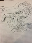
I actually thought of this joke a while ago. When telling it to people, the idea where a sperm whale would satisfy both of their desires really set in. That’s why I chose to show that text for an entire scene. It was also to give a little sense that them seeing the sperm whale takes place later. The hardest part of this assignment was the idea behind the comic. Once I could solidify the idea as a comic, it became the challenge to decide what the most important elements of the humor were so that they could be distributed appropriately into the three scenes. Another challenging aspect of this assignment was the brevity. Typically in other writing assignments given in writing classes, there is the general idea that longer and more explanation is better. In this case, however, that is not true. Adapting to that change was interesting but allows for more creative interpretation than formal writing does.


1 2