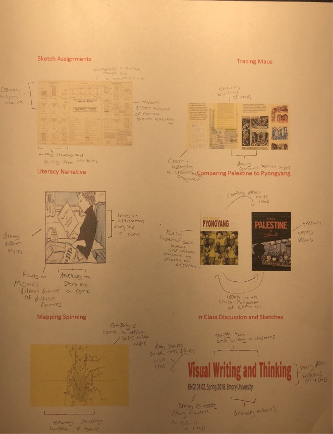
Sketch 11: Assemblies Reflection

This sketch assignment allowed me to reflect on my growth throughout class.  This will certainly help me write my cover letter.  I decided to section each major assignment/task that we have competed in class.  Then, I proceeded to break down my learning accomplishments from each assignment.  I decided to group all the sketch assignments together.  Though some were markedly different than others, each one seemed very similar to me.  I believe that this is probably because ethyl had similar objectives: to create some sort of visualization. However, it was also because I tend to do all of them around the same time each Sunday.  The assignment that I enjoyed breaking down the most was the literacy narrative.  The literacy narrative was probably the most challenging assignment, but it incorporated a culmination of everything we learned in class up until now.  I also saw, as I broke it down, the growth throughout the assignments.  I realized how effective McCloud’s book was in helping me create my literacy narrative.  Lastly, I figured that i would include in class lectures.  They were blatantly helpful in allowing me to hear a diverse sea of ideas.

Mapping Spinning Reflection

Similar to nearly all the assignments we have completed thus far, Mapping Spinning enabled me to see themes vividly through visualization rather than sheerly textual analysis. I understand Spinning more as a progression of a struggling girl’s adolescence than I did before.  Obviously this is a narrative of the story, but when I see it through, for example, the bar chart of the first and last one hundred pages, I can notice a progression.  In my interpretation, though Walden has stated there was indifference, the yellow exemplifies significant and more dramatized moments.  With this principle, it is logical to see the intensity build up through the book.  Especially this is notable where, through this sequence, Tillie quits skating, has the car crash encounter, and has the sexual assault incident.  Without analyzing these through visual representation, it would be difficult to see.  This, also, pertains to how you can see the themes flowing through the tree diagram.  The question that led me to analyze the feature of the illustration was to discover the significance of the yellow coloring.  Another was to uncover the main themes and how they connect to each other in the scope of a coming of age story.

My map took its shape because I wanted to incorporate qualitative and quantitative data together.  I decided to us eh helpful Data Visualization Catalogue in order to explore my best options in displaying the data.  Rather than using only one, I wanted to gather a firm argument by having three pieces of evidence.  A limitation of my map is that it does not have a definitive explanation through visualization.  True, I draw my conclusions through my textual analysis, it is not displayed in its own chart.  A strength to my map is that it extracts key information of the comic that illustrate the main ideas of Tillie’s experiences.  It brings her story together concisely, comparatively, and vividly.

Sketch 10 Reflection

This particular assignment was unique because it involved a long process with data collection.  I was tracking to see my overall emotional health through this assignment where I posed four different factors: productivity, happiness, positivity, and confidence.  These, I believe, are salient in determining a spectrum of emotional health.  Though more categories can certainly be added, these seemed to be solid universal determinants.  I scaled them based on what degree I felt at the current time (12 PM and 6 PM everyday for a week).  The lower end of the spectrum was towards one, while the opposite was ten.  In  essence, I was trying to determine if these factors are related  to my overall mental state; rather than one question, it was a an exploration to narrow down a correlation.

Though I cannot definitively state causes, there does seem to be some evidence to assert an adequate correlation.  One is that the “happier” I was, generally the more positive and confident I was.  About half the time, when I was productive, i was surprisingly happier.  Another important illustration in the data was that I tended to be happier and less productive on the weekends.  I do, however, feel uncomfortable jumping to a precise conclusion because my measurements were obviously very subjective.  For instance, an 8 happiness one day could be completely different than an 8 another day.

I chose to visualize the data in two ways.  The first is a bar chart that blatantly shows the data and neatly sorts the information by color.  I felt that this would be the easiest way to interpret it.  Next, I put the data into a line graph.  The line graph shows information over a period of time.  This was appropriate for the information that was taken at two times over a week.  If I were to continue this project, I would replicate my process. This is assuming that i begin to get a better grasp on how to adequately use the subjective measurements and create a proper, consistent standard.

This certainly was a valuable tool for self analysis. Often times, and proven true in this case, it is easier to conceptualize information when the data is visualized.  Also, keeping track of these measurements allows for a deep degree of introspection that one may generally ignore.

Comparing Palestine and Pyongyang Reflection

The controlling idea of my essay is the similarities and differences from the vignettes in both Pyongyang and Palestine and an analysis on how they affect the reader and the books.  In order to start writing this assignment, I had to first lay out three ideas that I wanted to write about.  So, I decided to make three paragraphs-either two similarities and one difference or one similarity and one differences.  Then I settled on my three ideas.  I also wrote my thesis statement after I wrote my body paragraphs.  For me, this is uncommon.  This draft cannot be quantified because I wrote each paragraph individually, and then I edited each.  So, the “nth number” of draft is not sufficient to characterize hod I revised this piece.  A method I used was writing my notes on the top of my paper, and then following it while I wrote my paper.  Also, as aforementioned, I wrote the paragraphs separately like different prompts.  The organization broke down to five paragraphs: One introduction, two differences, one similarity, and a conclusion.  Overall, this project challenged me to further analyze both texts.  Surprisingly, I also had to analyze the pictures as well because they had the same amount of information.  Overall, I extracted more information from the comics from this essay.Comparing Palestine and Pyongyang

Sketch 9 Reflection

I order to decide which scene I was going to use, I simply searched “famous movie scenes” on Google Images for inspiration.  While browsing through, I saw the “thunder buddies” scene from Ted.  I thought, since they were swearing in the moment, that this would be pretty edgy.   Also, I believed that it would be rather comical.  So, instead of putting myself in the picture, I asked one of my funniest friends, Merrick, to be in it because I knew he would portray the image significantly better than I would be able to.  Clearly, a hinderance to this assignment was the lack of exact materials, vivid cameras, and CGI.  However, I made it work by using a stuffed animal that resembled a teddy bear.  Though this assignment was brief, it was one of the most fun.  This is because it involved looking to replicate a move rather than just draw a sketch, so it enabled me to look into a different form of art for the “sketch” assignment.

Sketch 8: Combophoto Reflection

This was an extremely difficult assignment to start.  This is simply because it was hard to think of two image that would work together as a combo photo.  It took me some time to piece together the objects that I wanted to use.  As always for assignments likes this, I searched around my room.  Fortunately, I looked out my window and saw a construction crane.  I thought that would be a pretty simple idea to bounce off of.  Then, I noticed my ruler that I was using to put the finishing touches on my literary narrative.  I now had my two objects.  However, it was also difficult to find the image that would work in order to make these two come together.  Finally, I found a complex image of a crane and decided to pair it with a simple image of a ruler.  I have very limited experience with photoshop and related programs.  Putting the images together was slightly confusing, but I eventually figured out how to use the basic functions of Pixlr.  My image displays the precision and complex levels of construction.  The ruler ought to be considered one of the simplest tools tone used in building, measurements, and even construction; the crane can be considered and extremely complex one.  Therefore, i combined both these two levels to display the crying degrees.

1 2 3