Due: 4/22
Tag: sk10
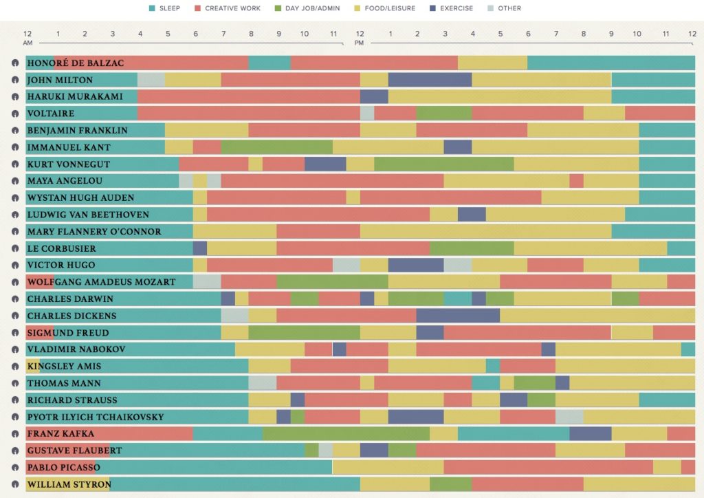
When Mason Currey wanted to understand how he could manage to produce more creative work despite the challenges of everyday life, he set about studying how a bunch of other famous creative people organized their daily lives and what routines they established for their own creative work with the assumption that there were valuable lessons there. Daily Rituals was the result of that research — and then a number of different people and organizations have set out to visualize the insights of that book so that we can see larger patterns in the midst of all this biographical information. Podio’s graphic, which is the feature image on this post, is one of those (check out their site for the interactive version)
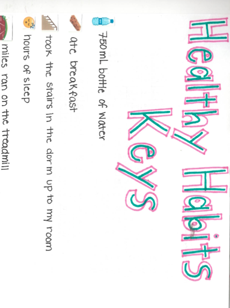
For this sketch assignment, you will choose one concept in your life that you want to analyze, something that is not already easily and obviously measured, or doesn’t vary within the span of a day or a week (good categories: awesomeness, mindfulness, healthiness, creativity, productivity, and similar … bad categories: number of steps, hours of sleep, caloric intake, how good is my eyesight?). Decide on a set of about 5 categories that you can use to measure that concept in your life and track those categories for a week or more, then you will produce a visualization of the data that you have gathered and use that visualization to help you understand something about your own life that might not be obvious from your own day to day activities.
Tracking Data
If you’re looking for suggestions about what to track, browsing the “quantified self” tag at Lifehacker might be worthwhile.
Once you’ve got categories, create a spreadsheet where you can track those categories throughout the day. Either take notes in a journal or on your phone and enter the results into your spreadsheet at set intervals, or make the spreadsheet in Google Drive and access it from your phone, or use the site Trackthisforme, or install a tracker app on your mobile device (I found some by searching for “quantified self” apps).
In “How to Track Everything in Your Life Without Going Crazy” and “Fill Out This One-Minute Form Every Day and Find Out Why Your Life Sucks (or Doesn’t)” Adam Dachiss has some useful suggestions for measuring stuff in your life. “Why You Should be Tracking Your Habits and How to Do It” by Belle Beth Cooper is also useful. However, all three of those articles are a few years old now and might not be perfectly applicable.
Whatever method you use, the key activity is to decide what you are going to pay attention to and then to create a system that is manageable for your life for the span of a week wherein you will quantify information about your self or your behavior.
For example, one step of this process might be to decide to measure how happy you are and to create a spreadsheet with a column for “Happy.” Then when you wake up in the morning, while you’re waiting for the coffee to brew, you’ll pull up the spreadsheet and enter a number between 1 and 10 indicating how happy you feel. You will continue adding rows at some set interval (every hour maybe). You will probably have some columns that are a little less subjective than “how happy do I feel right now?” (like “how many times did I talk in class today?” or “how much time did I spend studying?” “how many minutes have I spent looking at my phone in the last hour?”). You can decide how objective or subjective your categories are, but recognize that those decisions will impact the sorts of conclusions you draw from this process.
For now, you just need to decide what you will track and then to be as meticulous and careful as you can be about actually tracking this information either directly into a spreadsheet or in a format that can easily be transferred into a spreadsheet at the end of the week.
I will follow up with more information about visualizing that data once you’ve collected it, but don’t worry too much about that yet. Just collect data and pay attention to any patterns you notice while you do so.
Visualizing that data
Now that you have gathered your data, it’s time to analyze it further and visualize it.
With the data set that you’ve gathered, which is just for a week or so and only with a handful of variables, you probably won’t need a computer or special tools to analyze it. However, you might find loading your data into a spreadsheet (like in Excel) if you haven’t already been keeping it in that format will help you a lot to analyze it and see patterns in the data.
Because this is an assignment about collecting data about your own life, there is room for you to decide how “scientific” you want to be with your project. Even if you have never used spreadsheets for much of anything, try to quantify your data as much as you can and make an effort to be detailed and accurate with your information, but that said the types of data you chose to collect and the category you’ve decided to study will have a huge impact on the type of analysis you undertake. It is okay for you to have some more subjective categories and it’s okay if your final analysis or visualization is somewhat subjective too.
Tools
There are numerous methods you can use to create your visualization — anything from paper and crayons/markers/pencils to sophisticated data visualization software like Tableau. MS Excel also has some pretty sophisticated charts that you can create from your data. And there are also lots of free online tools that you can use too — it’s admittedly been a year or more since I really surveyed the set of free tools available, but I’d probably still recommend Infogram if you want a free web-based infographic maker and aren’t sure where to start.
For help deciding what type of chart or graph might be most effective in visualizing your data, consult the Data Viz Catalogue (it might be most helpful for you to switch to the “sort by functions” view at the top of the page).
Digital Images
Hand-drawn charts and graphs are perfectly 100% acceptable, if that’s what you prefer. However, please do not spend lots of time carefully crafting hand-drawn charts and then snap a crappy picture of them on your cell phone to post to the web. There are lots of scanners available on campus that you can use to scan your chart into a high-quality JPG image — I’d suggest that you take a quick trip to the Media Lab on the 4th floor of the library and scan your drawings. That space is underutilized and an excellent resource that you should know about.
If you create your visualizations with an online tool, just make sure that you can export them as a JPG image, or that you can at least take a good screenshot of your work.
Publish
Publish your charts as a sketch post to your site. Identify what conceptual issue you were tracking or what question you wanted to answer (or begin to answer). Include 2 or 3 paragraphs explaining what conclusions you have drawn from the data that you collected. Were you able to answer the question you had posed for yourself? What sorts of judgement calls did you face while gathering the data? Why did you choose to visualize your data in the manner that you did? What do these visualizations say about your own life? If you were to continue this project into the future, would you go about it in pretty much the way you have done this week or would you do things differently now that you have looked at the data to this point? Have you found this to be a valuable tool for self analysis?


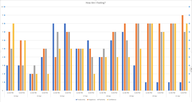
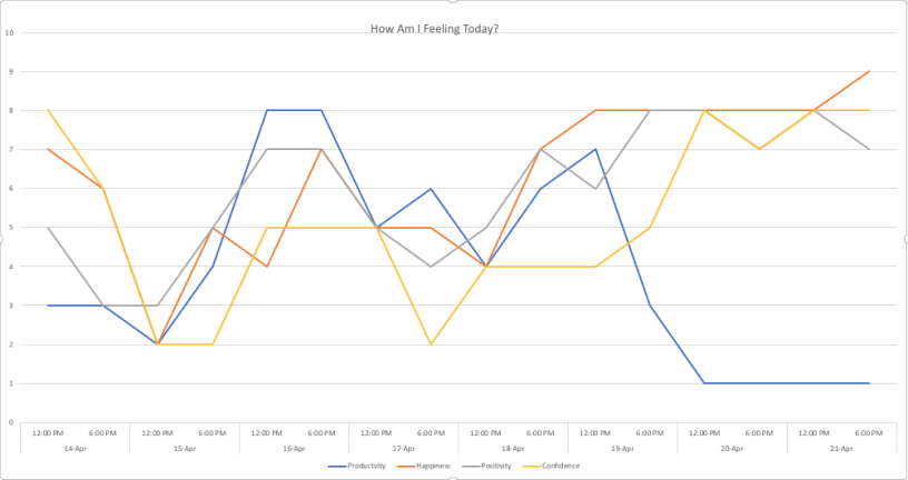
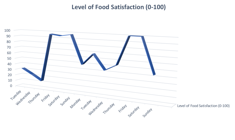 Throughout the span of almost two weeks, I recorded my level of food satisfaction on a subjective scale of 0-100. This tracking assignment yielded some interesting results, which after developing a visual representation of the data, revealed key information about my eating habits throughout the week.
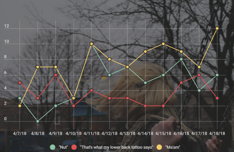 Just saying the word “ma’am” in response to anything that aggravates me, might not be a joke exactly. But it makes me laugh and I say it lot so I included it. Alongside that are the phrases “nut” and “that’s what my lower back tattoo says” (as I’m trying to explain these jokes I realize that my sense of humor might be a little off-the-wall) Sometimes I respond to things that people say with “that’s what my lower back tattoo says.” ie: My friend was talking about something and said the phrase “You don’t have to be perfect” and my response was “that’s what my lower back tattoo says”. “Nut” is just an oddly sexual and super inappropriate way to respond to anything that I think is cool. Another friend of mine told me that she was going to a lecture about traditional African art and the movie Black Panther and my response was “nut, dude”.